
Comparison Tool
For IU Fernstudium, I developed, through various iterations, a program comparison tool. The tool is especially crucial given the abundance of courses available for online study. It is in continuous development. Tools used: Figma, RapidUsertest, Google Analytics
Problem Statement
Our user requires a method to compare various courses of study to identify the most suitable option for their needs.
First research
I initiated the project by conducting a competitive analysis, examining not only our competitor's website but also diverse platforms such as e-commerce sites. Subsequently, I conducted interviews with colleagues from the study consulting team to gain insights into the most common user questions. Additionally, I conducted a card sorting activity with them to fine-tune the sequence of fields in the table.
Prototyping
Following the initial research, I initiated several iterations of prototyping, beginning with low fidelity and progressing towards the first high-fidelity prototype. The prototype underwent refinement and discussions with the Product Owner (PO) and Development Team. Collaboratively, we determined the features required for the Minimum Viable Product (MVP). A final design iteration was completed and, upon approval from the PO, the tickets were generated for the tool's development. Since there was no comparable tool before, we opted to directly publish it on the website and then analyzed its impact on user behavior.
MVP
The initial MVP has been developed. I followed the process, taking responsibility for QA on every ticket until the tool's launch. Additionally, I assisted the data analyst in identifying key metrics to be tracked, ensuring we had sufficient information to evaluate the tool's success.


Analysis
An initial analysis was carried out on the tool after six months of collecting data through Google Analytics and simulating user interactions. This analysis played a crucial role in identifying pain points and potential improvements. Additionally, the possibility of leveraging the tool for conversion optimization emerged, such as integrating the option to order brochures directly. The significance of the tool for users was evident, leading the Product Owner (PO) to decide on further investment in its development. This analysis subsequently prompted the initiation of a usability test.
Usability test
A usability test was subsequently developed using RapidUserTest. Thirteen users participated in the test via smartphones, while one used a tablet. The participants ranged in age from 25 to 34 years, with an equal distribution of 50% women and 50% men. The test comprised seven tasks and five open-ended questions.

Major changes after the usability test
The information collected from the usability test has been prioritized, leading to the design and development of numerous new improvements. Here are some:
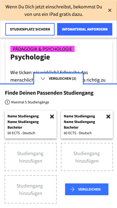
Bubble
A bubble was initially incorporated into the design, allowing users to access an overlay for managing the study course within the table. Despite the positive reception of the bubble, most users were not utilizing this feature and accessed the table solely from the catalog. Consequently, a new element has been developed to eliminate the overlay and enable direct interaction with the catalog.


BEFORE

AFTER
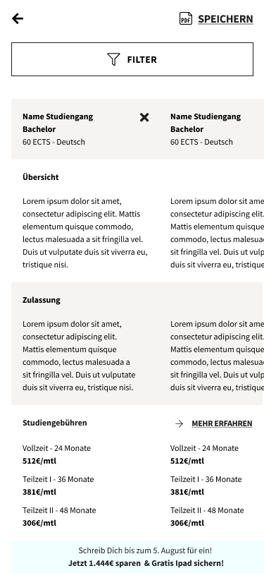


Share
The usability test revealed that users wished to print and share the collected information. Consequently, the feature to print a PDF and receive it via email was implemented, accompanied by a brief form to gather valuable user data for conversion optimization purposes.
Viewport optimization
The test showed that most users were using the tool in the portrait format, which had not been implemented yet. An optimization of the viewport was then designed and developed.

Add study path from table
One of the major issues for the users was the unavailability of the option to add new study paths directly from the table. This capability has been designed, along with a new suggestions feature.

New design for prices
The presentation of prices with the formulation "from..." was received very negatively by users who couldn't discern the differences between the prices and suspected that something negative was concealed. A new design has been implemented to improve clarity, and a link has been added to a page that clarifies the differences between the time models.

BEFORE

AFTER