
Convertion-focused website tools
IU Fernstudium · Marketing website UX · Decision-support tools · Conversion optimization · Mobile-first flows
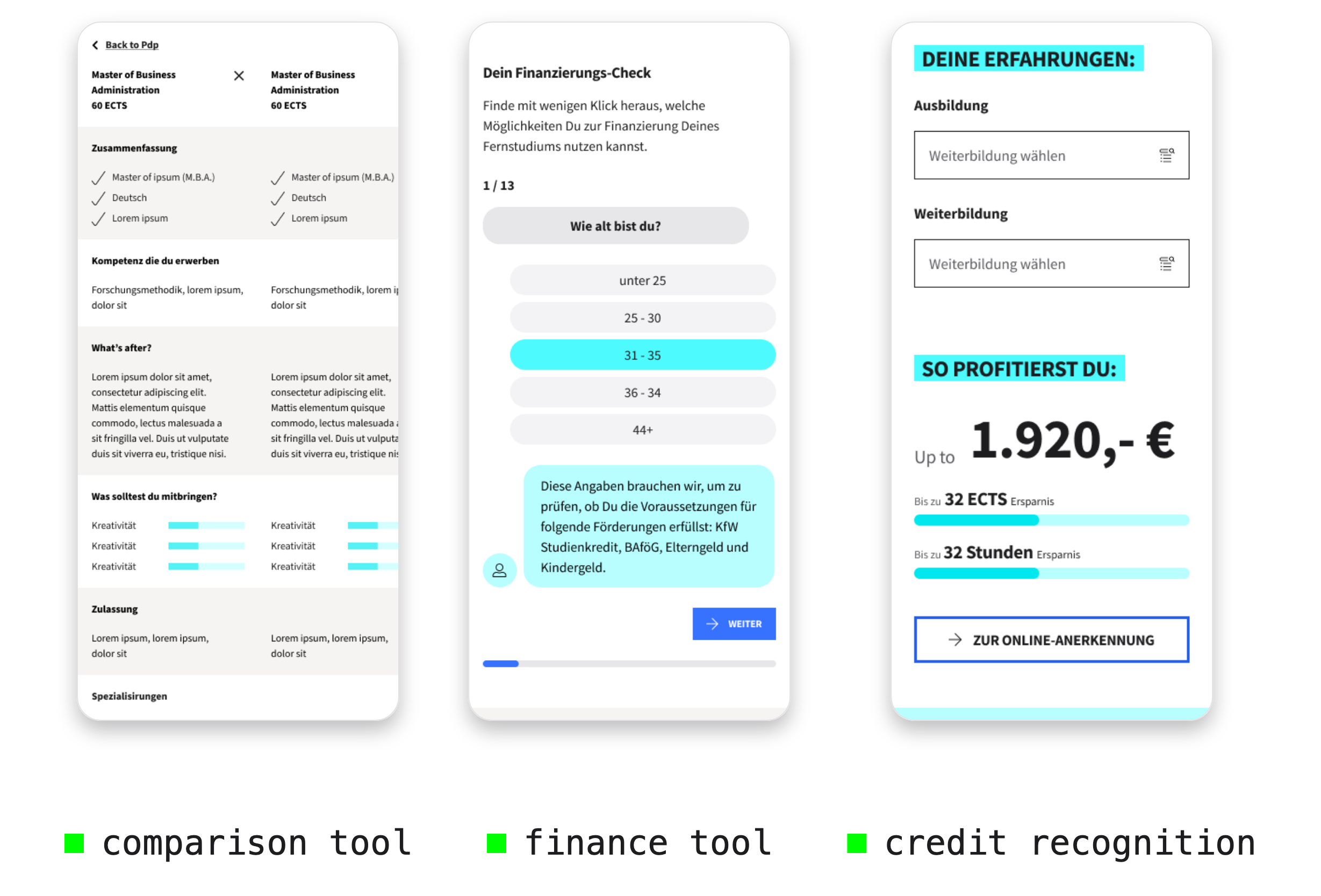
At IU Fernstudium, I designed website-based tools that helped prospective students understand complex decisions before applying — including financing options, study-program comparison and credit recognition.
The work focused on turning information-heavy topics into guided, mobile-first experiences that supported users earlier in the journey and created clearer paths toward conversion.
[01] 20–25% engagement increase for website-based decision-support tools
[02] contributed to +12% conversion uplift across improved website/application journeys
[03] contributed to 10% lower bounce rate
[04] contributed to 15% fewer support queries
[00]
OVERVIEW
The IU Fernstudium website is a key decision point for prospective students. Users arrive with different levels of intent: some already know which program they want, while others still need to understand study formats, costs, financing options and whether previous education or work experience can be recognized.
My work focused on designing tools that made these decisions easier to explore and act on. Instead of presenting complex topics only as static information, the tools guided users through focused questions, personalized feedback and relevant next steps.
Project details
Role: UX Designer / Product Designer
Company: IU Internationale Hochschule
Product area: IU Fernstudium marketing website
Focus: Website UX, decision-support tools, finance tools, study-program comparison, credit recognition, conversion optimization
Methods: User flows, wireframes, prototypes, usability testing, analytics review, stakeholder alignment, mobile-first UX, developer handoff
Collaborators: Product owners, developers, marketing, sales, CRM, content managers and business stakeholders
[01]
THE CHALLENGE
Choosing an online study program involves several high-consideration decisions. Prospective students need to compare programs, understand costs, evaluate financing options and estimate whether previous education or work experience can reduce study time or fees.
The challenge was to make these topics easier to understand without overwhelming users or pushing them too early into an application step.
Key challenges included:
complex study and financing information
high cognitive load on mobile
unclear comparison between study programs
abstract credit-recognition rules
different user needs depending on background and intent
the need to support both user confidence and conversion goals
[02]
MY ROLE
I worked as UX Designer / Product Designer in the website marketing team, collaborating with product owners, developers, marketing, sales, CRM, content managers and business stakeholders.
My role included clarifying requirements, mapping user flows, creating wireframes and prototypes, supporting usability testing, aligning with stakeholders, preparing developer handoff and reviewing performance signals after launch.
I focused on translating academic, financial and business information into clear, mobile-first flows that helped users understand their options and continue with more confidence.
Role areas:
Product framing: user problem, requirements, stakeholder alignment
Experience design: user flows, wireframes, prototypes, mobile-first patterns
Delivery: developer handoff, QA support, content alignment
Optimization: analytics review, usability feedback, iteration proposals
[03]
DECISION-SUPPORT APPROACH
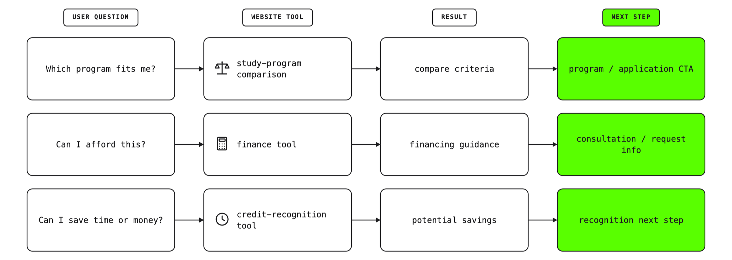
The tools followed a shared pattern: start with a user question, guide the user through simple inputs, show a more relevant result and connect the result to a clear next step.
Question → Input → Result → Next step
This approach helped make information-heavy topics more actionable:
from “Can I afford this?” to “Which financing options might fit me?”
from “Which program should I choose?” to “How do these programs compare?”
from “Does my previous experience count?” to “How much time or money could I save?”
Design principles:
reduce long explanations into guided steps
keep mobile flows focused
use simple language for high-consideration topics
make results specific and useful
connect each result to a relevant CTA
support conversion without making the experience feel aggressive
FINANCE TOOL
[04]
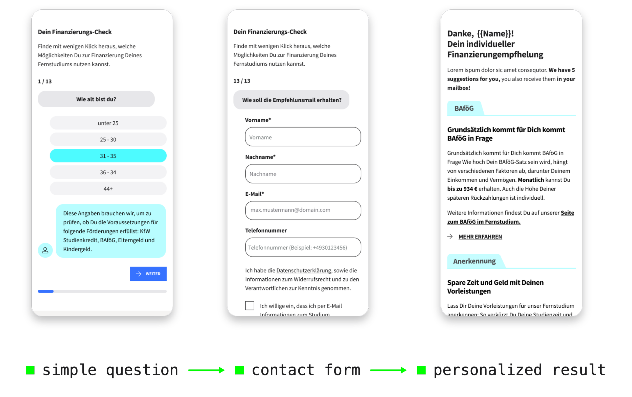
Financing is one of the biggest decision barriers for prospective students. The goal of this tool was to make the topic easier to approach through a short, guided flow.
Users answered simple questions and received more relevant guidance around possible financing options. This turned a dense information topic into a more interactive and understandable experience.
Design decisions included:
step-based question flow
simple language
visible progress
mobile-first layout
contextual explanations
result-oriented CTA placement
lightweight interactive elements to make the flow feel less intimidating
The finance tool was part of a broader set of website-based decision-support tools that showed validation signals of 20–25% higher engagement.
[05]
STUDY-PROGRAM COMPARISON
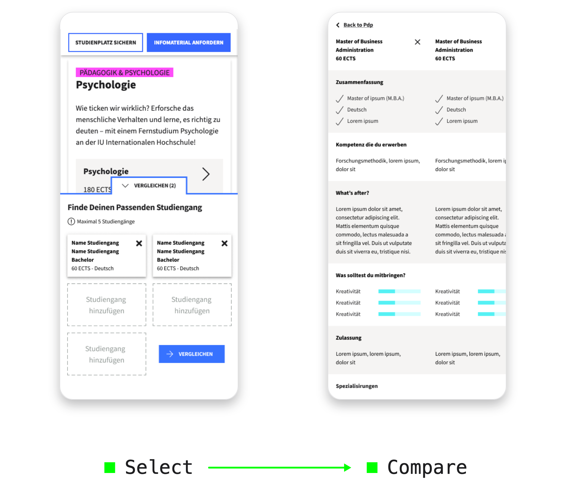
Prospective students often compare several programs before deciding which path fits them best. The comparison tool helped users evaluate selected study programs side by side without switching between multiple pages.
The goal was to make program exploration more structured and support users in moving from research to a clearer next step.
Design decisions included:
side-by-side comparison of selected programs
clearer structure for key decision criteria
mobile-first layout for content-heavy information
reduced need to jump between program pages
persistent orientation during comparison
CTA placement connected to the user’s decision stage
The tool helped make study-program research more actionable and supported users in continuing with clearer intent.
CREDIT-RECOGNITION TOOL
[06]
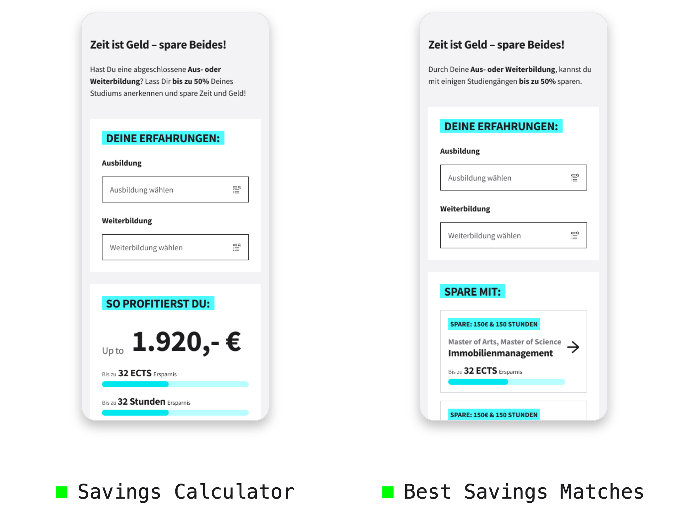
Credit recognition can help prospective students save time and money, but the rules are often difficult to understand. I designed a mobile-first tool that helped users enter previous education or work experience and receive clearer feedback about potential recognition opportunities.
The experience translated an abstract administrative topic into a more personal and motivating flow. Instead of explaining recognition only through static content, the tool showed users what they could potentially save and which study programs might be relevant.
Design decisions included:
simple input flow for previous education and experience
immediate feedback on potential savings
visual emphasis on time and cost benefits
relevant study-program recommendations
mobile-first layout
clear next step toward online recognition or further guidance
The tool supported prospective students in understanding the value of their previous experience and helped create a more personalized path toward application.
[07]
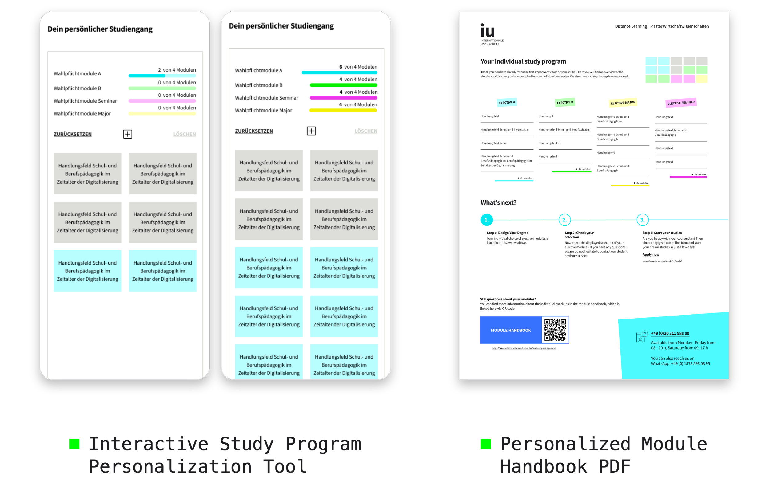
Design Your Degree was an exploratory concept for a more customizable study-planning experience. The idea was to let users build a study path by selecting course modules and seeing how their choices affected the overall program structure.
The concept explored how personalization and playful interaction patterns could make academic planning feel more understandable and engaging.
Although the concept was not implemented due to academic and organizational constraints, it helped clarify opportunities and limitations around modular study planning.
What the concept helped clarify:
users respond positively to interactive study planning
personalization can make academic structures easier to understand
modular study paths need strong academic constraints
concept work can reveal both user value and implementation limits
EXPLORATORY CONCEPT: DESIGN YOUR DEGREE
[01] Validation signals showed 20–25% higher engagement with website-based finance and decision-support tools.
[02] Contributed to broader website and application journey improvements, including +12% conversion uplift.
[03] Contributed to a 10% lower bounce rate through clearer journeys and more relevant decision-support entry points.
[04] Contributed to 15% fewer support queries by making complex topics easier to understand through self-service tools.
[05] Created reusable patterns for guided questions, personalized results, comparison logic and conversion-focused CTAs.
IMPACT & VALIDATION SIGNALS
[08]
[09]
LEARNINGS
[01] Decision-support tools work best when they start from the user’s question, not from internal content structures.
[02] Complex topics become easier when they are broken into smaller, guided steps.
[03] Results need to be actionable. A tool is most useful when it connects directly to a relevant next step.
[04] Conversion-focused UX should still feel supportive. The strongest flows gave users more clarity before asking them to act.
[05] Mobile-first design is essential for decision tools because even small amounts of complexity can become overwhelming on small screens.