
IU_One Domain Project
[01]
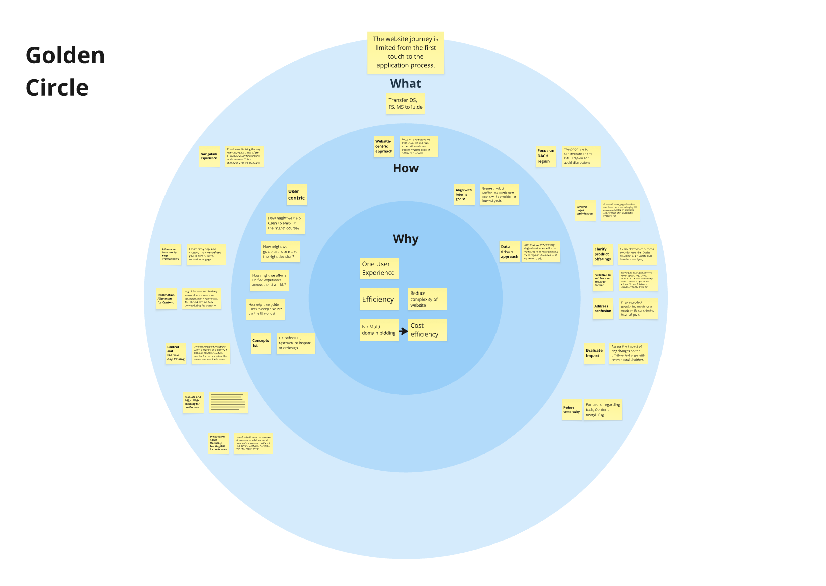
WHY ONE DOMAIN
Delivering a seamless, unified platform
Problem: Managing multiple domains for IU created unnecessary complexity:
High costs (development, hosting, maintenance)
Slow, complex operations
Fragmented brand and user journeys
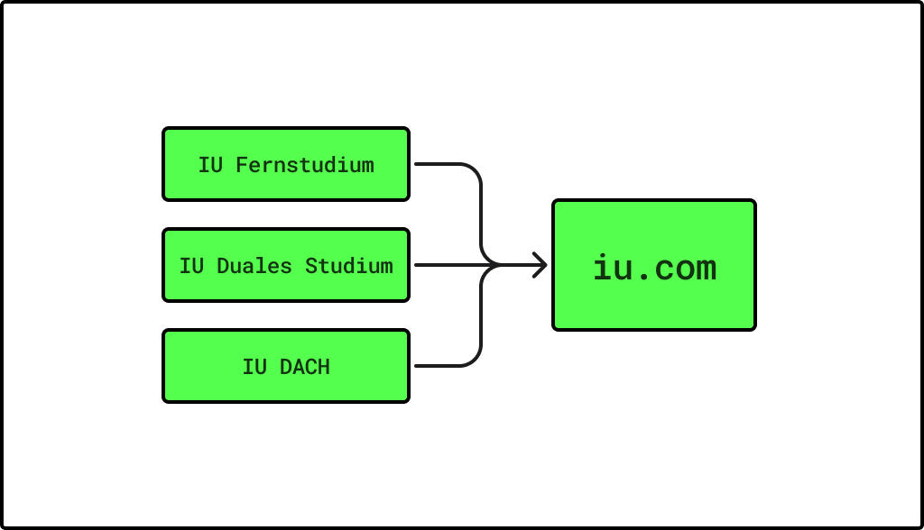
Solution: Merged several IU domains into a single unified site: iu.de This streamlined costs and operations, improved user experience with a consistent journey, and strengthened IU’s digital brand presence.
Results:
Lower operational expenses and simplified maintenance
Faster updates and feature rollouts
Stronger brand recognition and trust
Improved customer lifetime value (+5%) through better journeys and personalization
Mission: Delivering a seamless, unified platform that reduces costs, simplifies workflows, and elevates both the user experience and brand growth for IU.
[‘journey’,’efficency’,’consistency’]
[02]
DISCOVERY PHASE
Laying the Foundation
To begin, we decided to use the existing IU DACH website as the foundation for the new unified platform. Our first step was deep research into the three separate websites. As a team of two—a UX Designer (myself) and a Customer Experience Manager—we aimed to fully understand our users and identify all critical pain points.
We gathered and analyzed:
Existing user journeys across each site
Key user personas
Insights from a journaling study tracking the full customer journey
A/B test results on issues like navigation
Results from UX audits
This research helped us map the current experiences, spot overlaps and gaps. Our main objectives were to create new, relevant personas and define an updated, unified user journey for the new website. We also prioritized pain points and gaps in the current infrastructure, setting a clear direction for our design and development work.
[‘research’]
[03]
PERSONAS
Understand the user
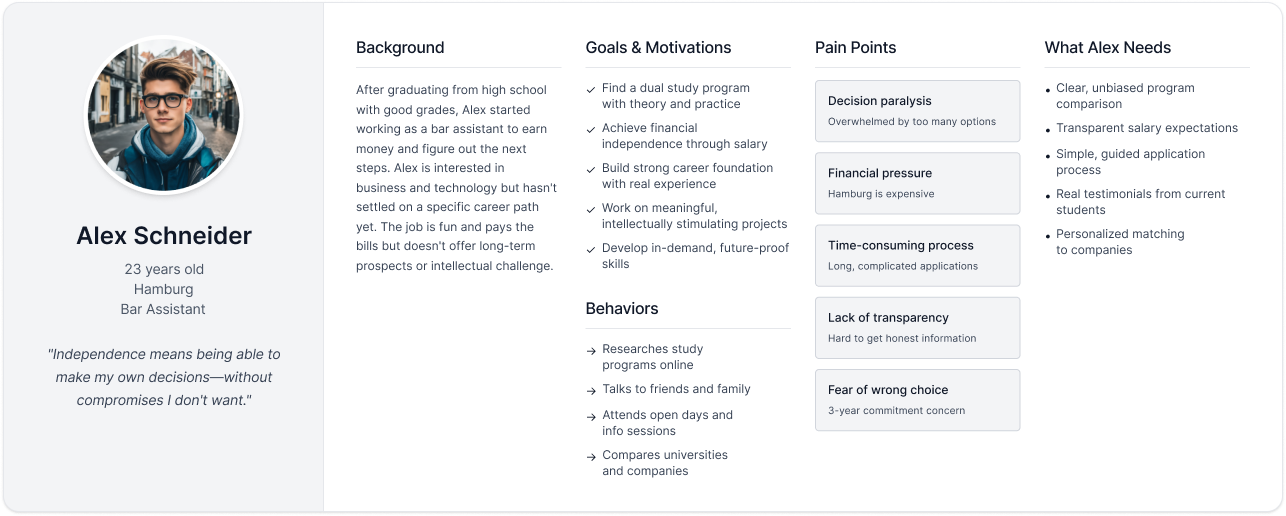
The three original IU websites each served different projects, targeting two distinct audience groups. We created two main personas to reflect this:
Working Professional: Older, already in the workforce, values flexibility and part-time study options to fit their busy schedule.
Recent Graduate: Younger, just finished school, seeks community, guidance, and opportunities to connect with peers.
These personas guided our design decisions, ensuring the new unified site meets the needs of both groups.
[‘user persona’,’user first’]
[04]
USER JOURNEY MAPS
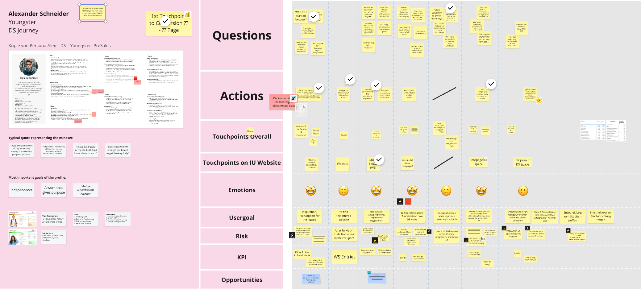
Understanding Steps, Emotions, and Opportunities
Next, we mapped the user journey for each persona, starting with the questions they might ask themselves throughout their experience. We organized these questions along a timeline, then identified the key actions users need to take—considering both website and external touchpoints.
For every action, we also mapped user emotions and goals, helping us understand not just what users do, but how they feel and what they hope to achieve. To complete the process, we identified possible risks, set relevant KPIs, and highlighted opportunities to improve the journey at each stage.
[‘emotions’,’goals’,’opportunities’]
[05]
PAIN POINTS AND GAPS
Identifying Essential Tasks for the New Journey
Next, we analyzed the IU DACH website to identify pain points in the current platform and gaps that needed to be filled to enable the new, unified user journey. We then prioritized these tasks, focusing first on core elements such as navigation, the home hero section, and product pages. Addressing these key areas was crucial to making the new unified platform possible.
[‘create tasks’,’prioritize’]

[06]
NAVIGATION
User guidance
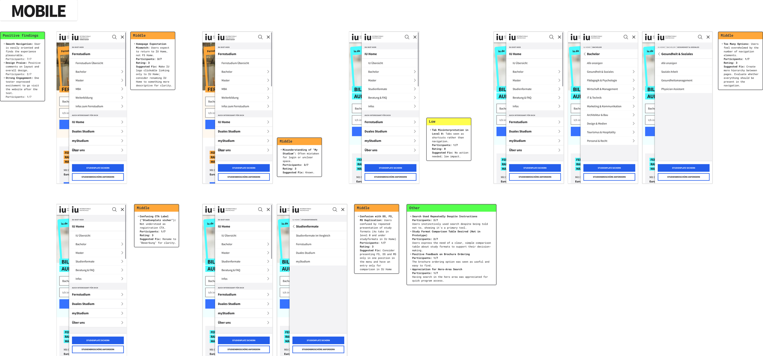
A key challenge for our users has been navigating the website efficiently. As the UX researcher on this project, I conducted usability tests with 12 participants (6 on desktop and 6 on mobile, ages 18–45, mixed genders) across three iterations of the navigation design. Since over 70% of our users access the site from their phones, the mobile experience was a major focus throughout the process.
Testing revealed that most users instinctively relied on the search function first, only turning to the navigation menu when search results were not satisfactory. We also found that the navigation contained too many links, making it overwhelming, especially on desktop, where users performed worse than on mobile. Based on these insights, I recommended simplifying the navigation by removing individual course links and keeping only the main categories. In addition, I suggested improving the on-page search functionality to better support user behaviors. However, the new navigation has not yet been implemented on the website, so the existing navigation continues to be a major pain point for users.
[‘usability test’]
[07]
PRODUCT COMPARISON
Improving Clarity Between Study Options
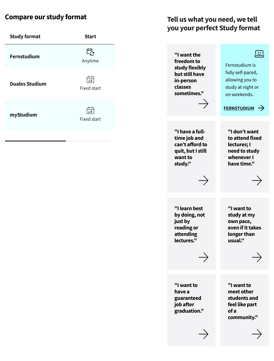
Through usability testing, we learned that users often struggled to differentiate between study options like Fernstudium, Duales Studium, and MyStudium. This made it challenging for them to choose the format that best matched their needs.
To address this, I brainstormed and presented several ideas, including an interactive tool inspired by a memory game that would match user needs with the best study option. However, after discussing these options with stakeholders, we jointly agreed that the simplest solution would be most effective. We decided to implement a clear, easy-to-read comparison table, allowing users to quickly and confidently see the differences between study formats and make informed decisions.
[‘prioritizing simplicity’]
[08]
HERO EXPERIMENTATION
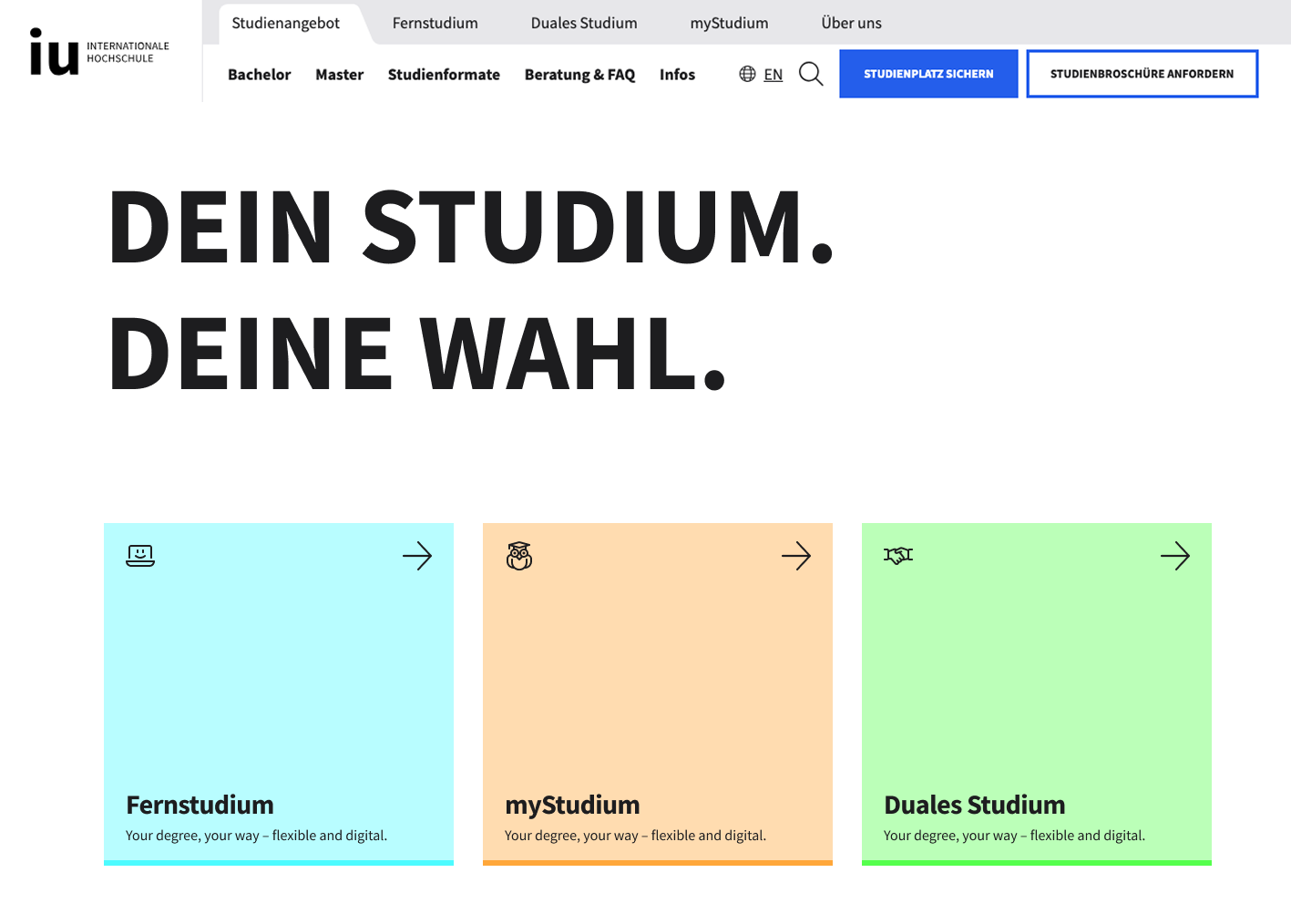
Aligning User Needs with Business Goals
In our research, we found that users’ primary need is to decide what they want to study, and only afterwards do they consider how they want to study it. However, business stakeholders were keen to guide users toward study formats (the "how") right from the start. To address this, we experimented with different hero section designs that encouraged users to choose their preferred study format as a first step.
To validate this approach, we partnered with an agency to conduct an in-depth user journey analysis, including 25 user interviews. The results clearly showed that this direction did not match actual user needs and created friction early in the journey. Based on these insights, we decided to abandon the new hero concept in favor of solutions that are more aligned with user expectations.
[‘user interviews’,’user first’]
SIMPLIFYING PRODUCT PAGE HIERARCHY
[09]
Working in a cross-functional taskforce
Our previous product page structure was overly complex, with multiple layers that confused users and made information hard to find. After our initial brainstorming, I presented three solutions to the team:
A single, consolidated product page for each program
A product page with dynamic elements (where information updates without leaving the page)
A product page with static expandable sections (such as accordions)
Working together in a cross-functional taskforce, we chose the dynamic elements approach. This solution allows users to easily explore all relevant product details in one place, without having to navigate through several pages. I led the prototyping from low to high fidelity, resulting in a much more intuitive product page and a solid foundation for future improvements.
[‘cross-functional’,’prototyping’]
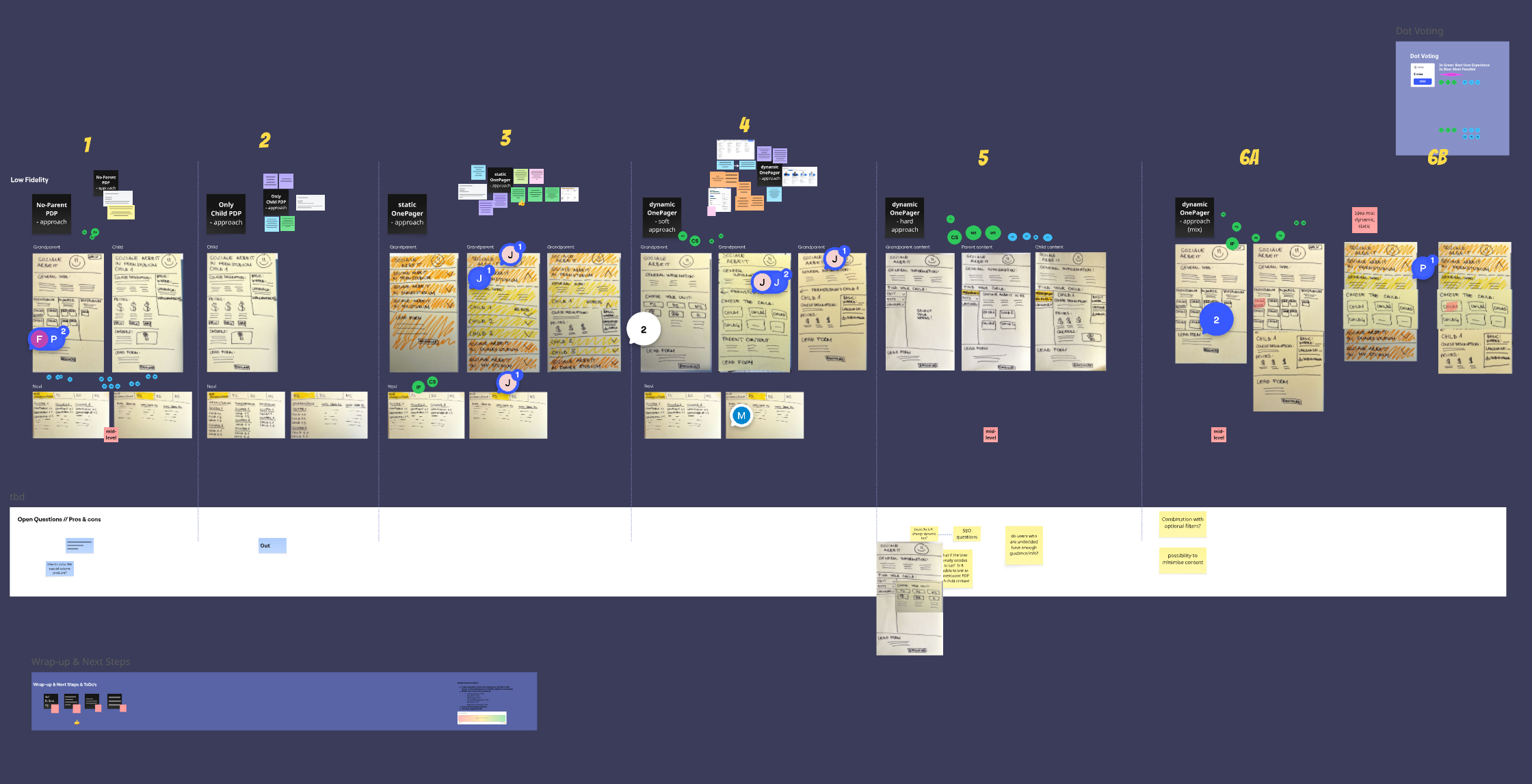
Ideation Workshop
[10]
CONCLUSIONS
Although the full migration to a unified platform (iu.de) was ultimately not implemented—mainly due to external business factors and the company’s decision to keep the Fernstudium and Duales Studium websites active—the project still brought valuable insights. Many of the improvements developed for iu.de, especially those enhancing navigation and user experience, are now being considered and applied across all IU platforms, helping create greater consistency and better journeys for users.
[11]
PERSONAL LEARNINGS
Strategic Collaboration: Working in a cross-functional team taught me the importance of balancing UX goals with both technical and business realities.
Stakeholder Communication: Managing shifting priorities and business risks helped me strengthen my communication and negotiation skills with stakeholders.
Adaptability: Prototyping various solutions and responding to changing project directions improved my flexibility and creative problem-solving.
Positive Impact: Even without a full launch, I learned that incremental improvements—shared across multiple products—can still meaningfully enhance the user journey.
Resilience: I gained experience in turning challenges and project pivots into learning opportunities, always focusing on how to deliver the greatest user and business value, regardless of the final outcome.