
Applicant portal onboarding & matching flow
Portal UX · Onboarding · Matching flows · Complex forms · Product analytics · AI-supported workflows
Redesigning key parts of a complex applicant portal to help dual study applicants understand their next steps, complete required actions and move through the application journey with more clarity.
[01] +12.1% appointment booking
[02] 76.6% / 75.8% onboarding completion/resolution rates
[03] 80% matching criteria completion rate
[04] 80.8% CTA engagement during live validation
[00]
OVERVIEW & CONTEXT
The applicant portal supports prospective dual study students at IU Internationale Hochschule through a complex application journey covering onboarding, qualification checks, practice-placement preferences, document preparation and guided next steps.
For many applicants, the process is unfamiliar and requires clear orientation: they need to understand what is required, complete actions in the right order and move between digital self-service and advisor-supported steps.
My work focused on redesigning key parts of this journey into a clearer, mobile-first portal experience with guided onboarding, visible progress, personalized next steps and measurable validation signals.
Project details
Role: Senior Product Designer / UX Designer
Company: IU Internationale Hochschule
Product area: Applicant portal for dual study applicants
Focus: Portal UX, onboarding, matching flows, complex forms, document builder, analytics
Collaborated with: Product managers, developers, sales/advisory teams, CRM, business stakeholders
Methods: Journey mapping, flow design, prototyping, usability testing, A/B testing, stakeholder alignment, Amplitude analytics, AI-supported analytics and prototyping workflows
[01]
THE CHALLENGE
The previous portal experience was fragmented and difficult to navigate. Users often had to move between different steps without a clear understanding of what was required, what had already been completed and what they should do next.
The main UX challenge was not simply to redesign individual screens, but to create a clearer journey structure that could support different applicant situations while staying simple, actionable and measurable.
Key challenges:
• unclear next steps across the application journey
• complex eligibility and qualification requirements
• form-heavy processes with high cognitive load
• need for mobile-first guidance
• dependency on advisor and operational workflows
• need to measure whether changes improved progression through the funnel

Before
After
[02]
MY ROLE
I owned UX/product design for key parts of the applicant portal experience, including onboarding, qualification logic, the main screen structure, matching criteria, document-related flows and post-launch measurement.
I worked closely with product management, developers, sales/advisory teams, CRM and business stakeholders to balance user needs, operational requirements, business goals and technical feasibility.
My responsibilities included problem framing, journey mapping, user flows, wireframes, prototypes, stakeholder alignment, developer handoff, QA support and analytics-based optimization after launch.
I also contributed to portal design system consistency by helping adapt existing website design system foundations into reusable portal-specific components and recurring UI patterns. This work later evolved into an AI-assisted portal system layer, described below.

[03] RESEARCH & PROBLEM FRAMING
[03]
To understand the main pain points, we looked at several inputs across the application journey:
• user feedback and qualitative insights
• portal behavior and funnel data
• support/advisor input
• usability issues from existing flows
• earlier user interviews and journey-based usability tests
The research showed that applicants often felt uncertain about where they were in the process and what they needed to do next. The journey contained several important steps, but they were not always presented in a way that felt connected or easy to follow.
Earlier user interviews and usability tests also showed that applicants valued a fast and straightforward application process, but needed clearer guidance, more transparent feedback and fewer unnecessary points of confusion.
This helped us frame the core product problem: applicants did not only need more information — they needed a clearer journey structure with visible progress, relevant next steps and guidance adapted to their situation.

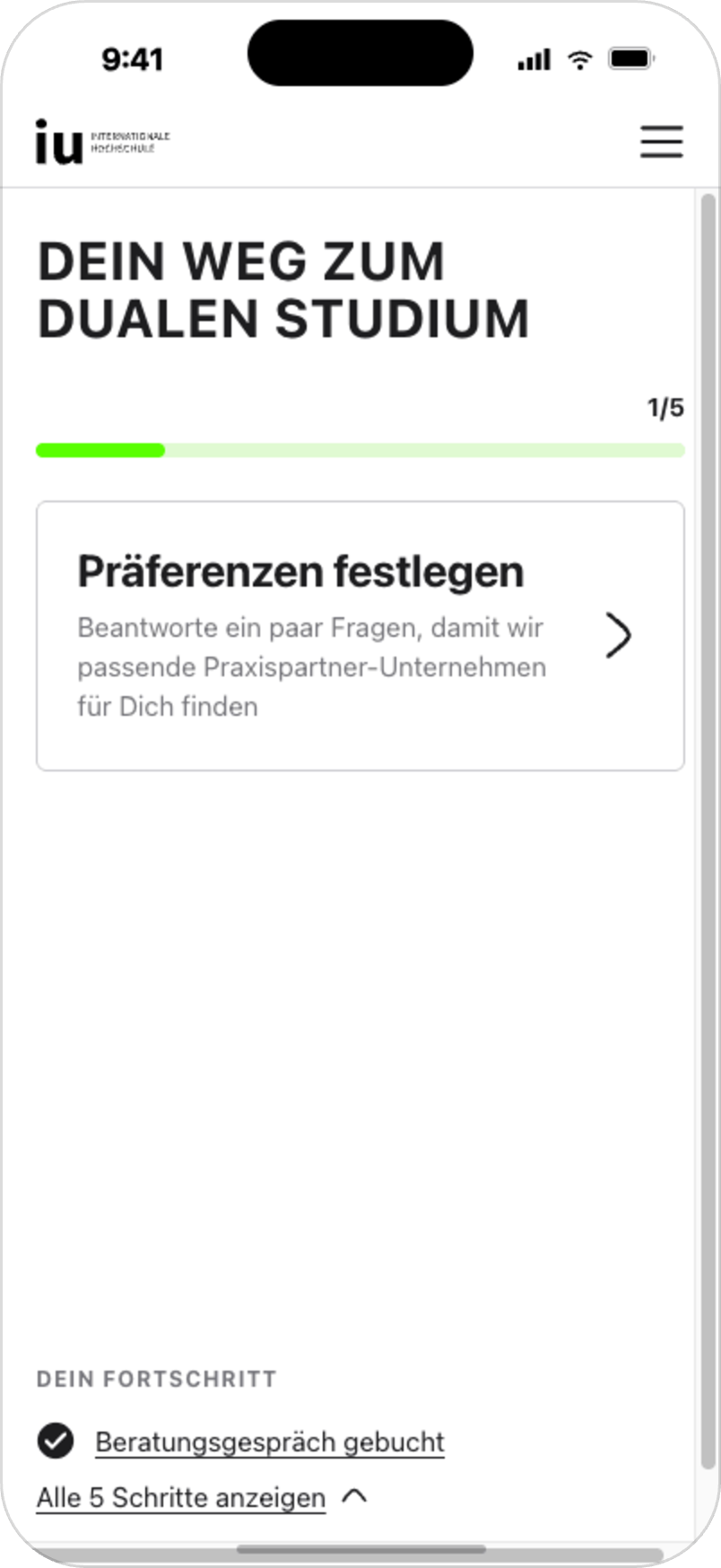
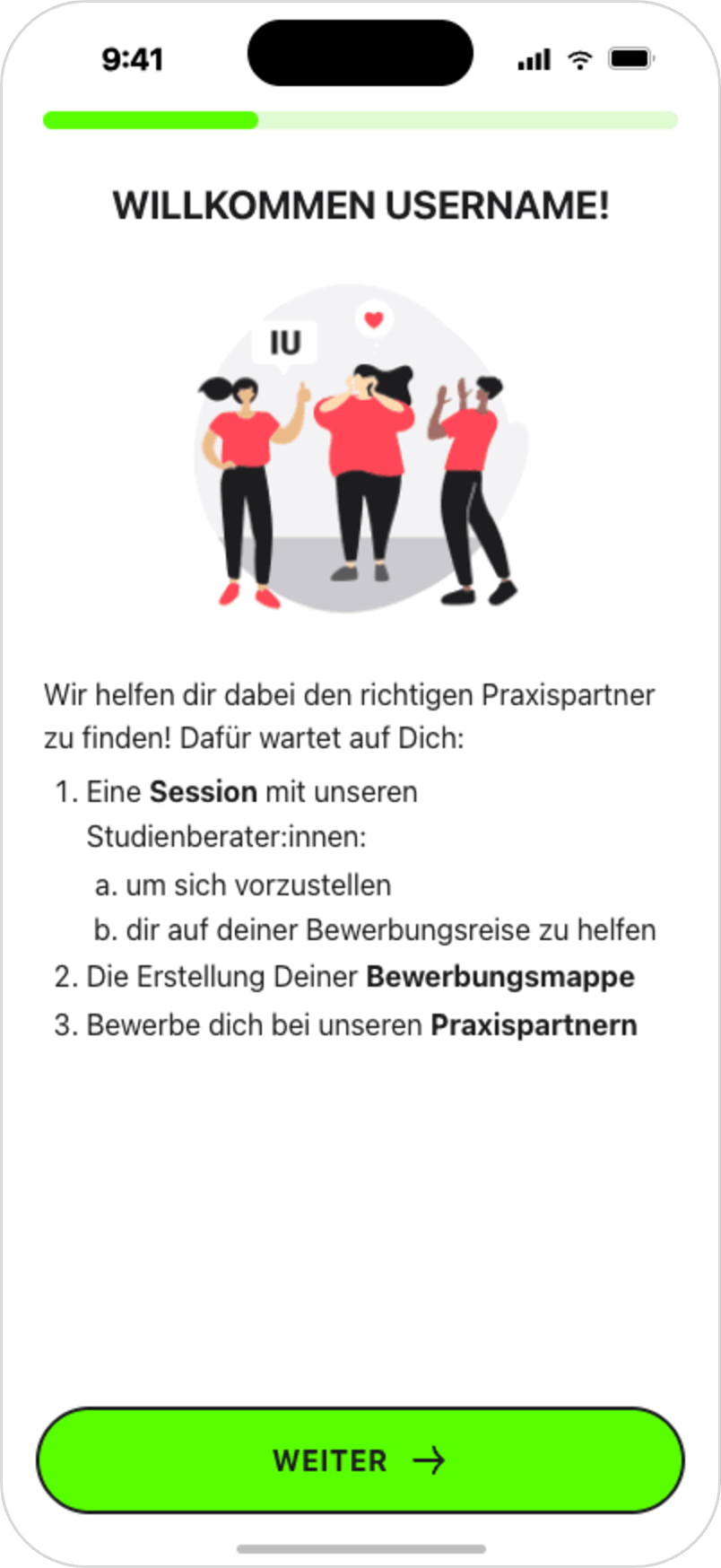
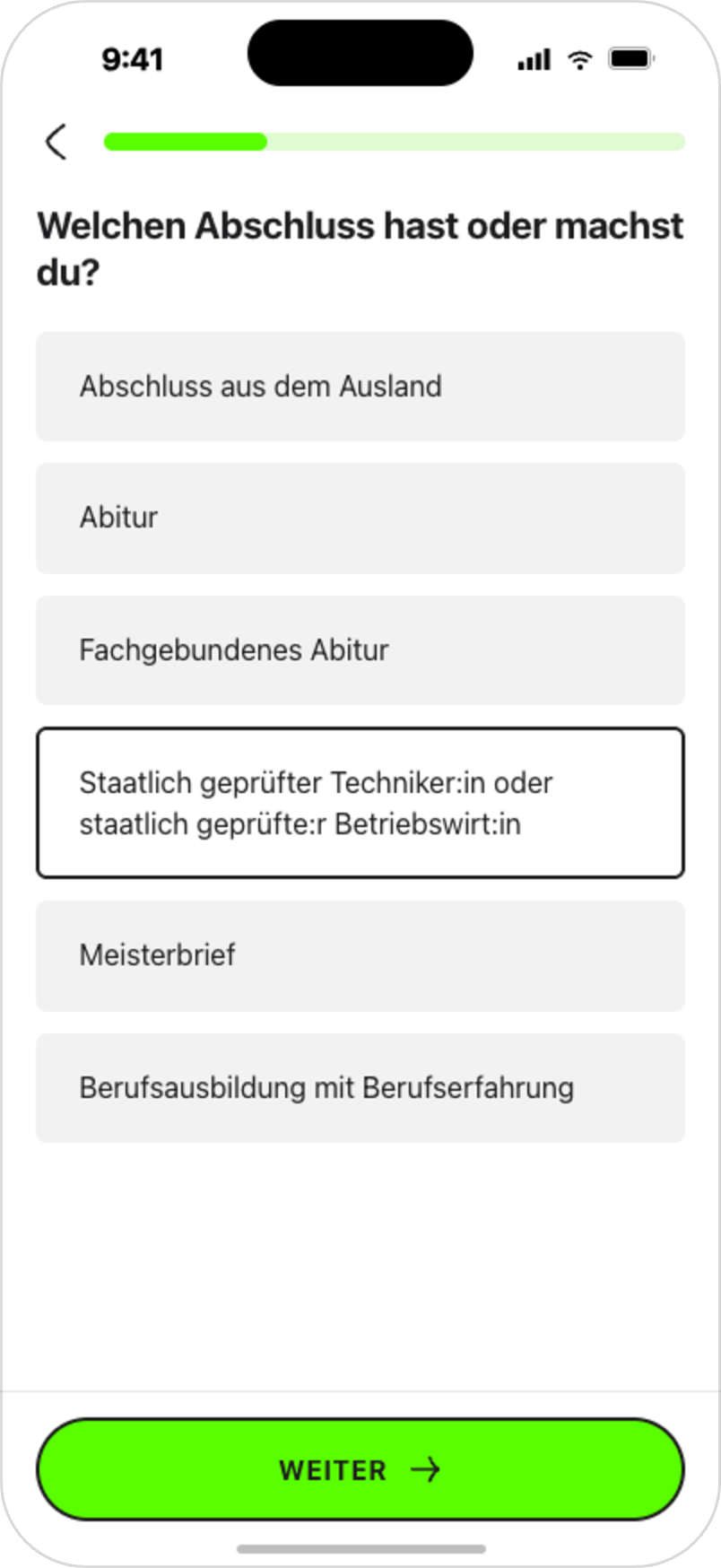
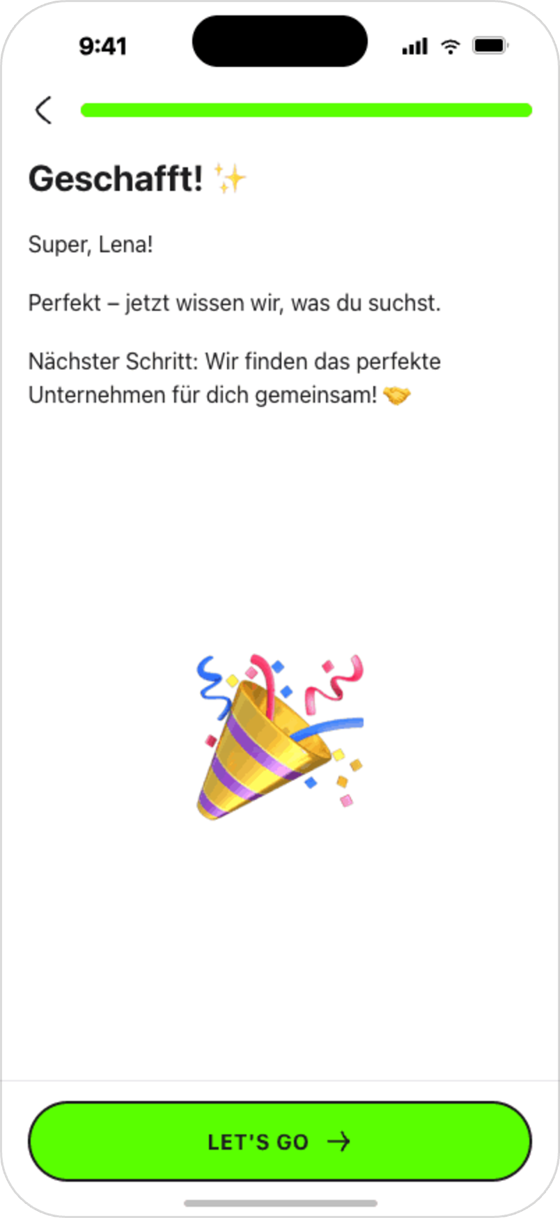
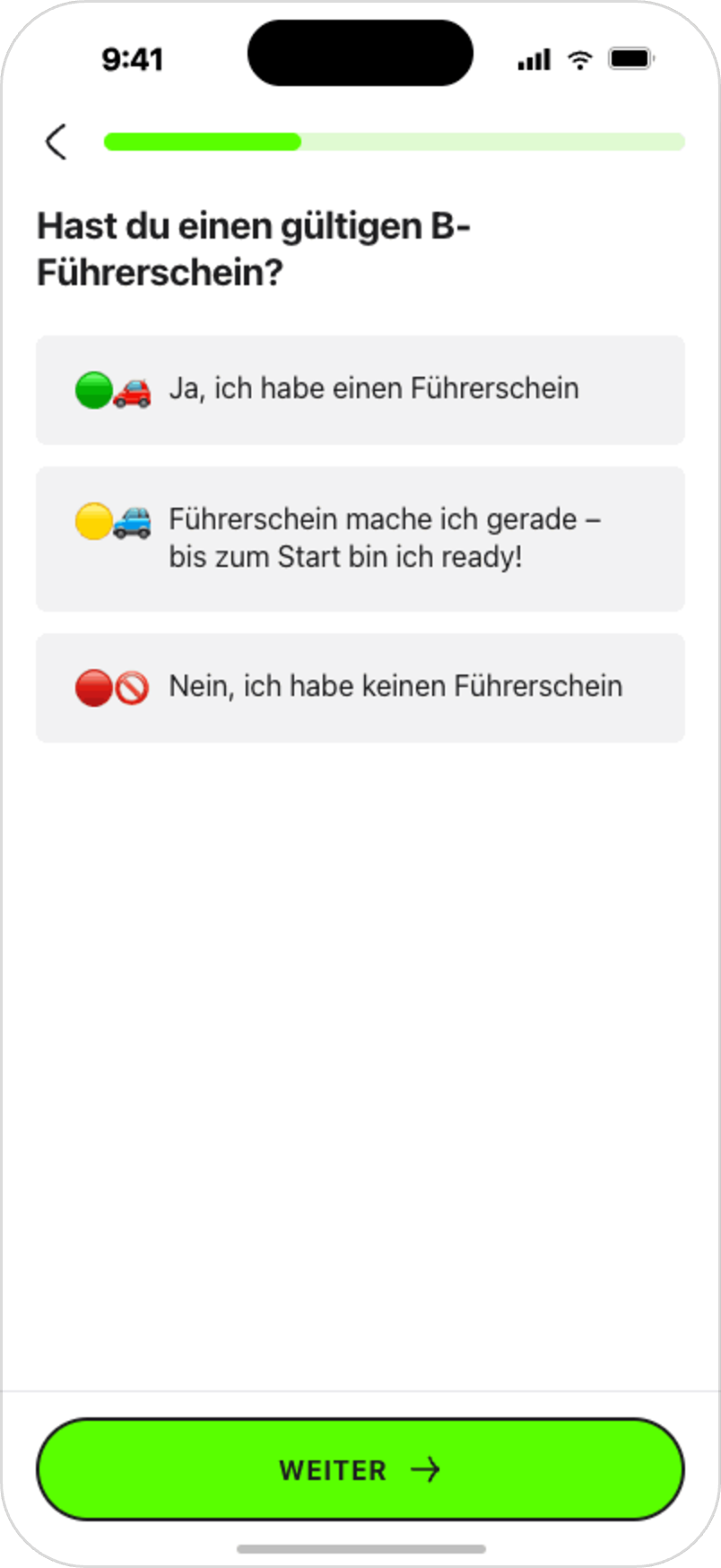
One of the first improvements was a redesigned onboarding and qualification flow. The goal was to help applicants understand whether they met the basic requirements and guide them toward the most relevant next step.
Instead of asking users to navigate a complex process without context, the new onboarding introduced the portal step by step and used qualification questions to personalize the journey early.
Design decisions:
• clear introduction to the application journey
• simple qualification questions
• one main action per step •
mobile-first layout
• visible progress
• early filtering to reduce unsuitable applications
• clearer guidance for users who did not meet specific criteria
The redesigned onboarding contributed to a +12.1% increase in appointment booking and reached 76.6% / 75.8% completion/resolution rates for German and international applicants.
ONBOARDING & QUALIFICATION FLOW
[04]

[05]
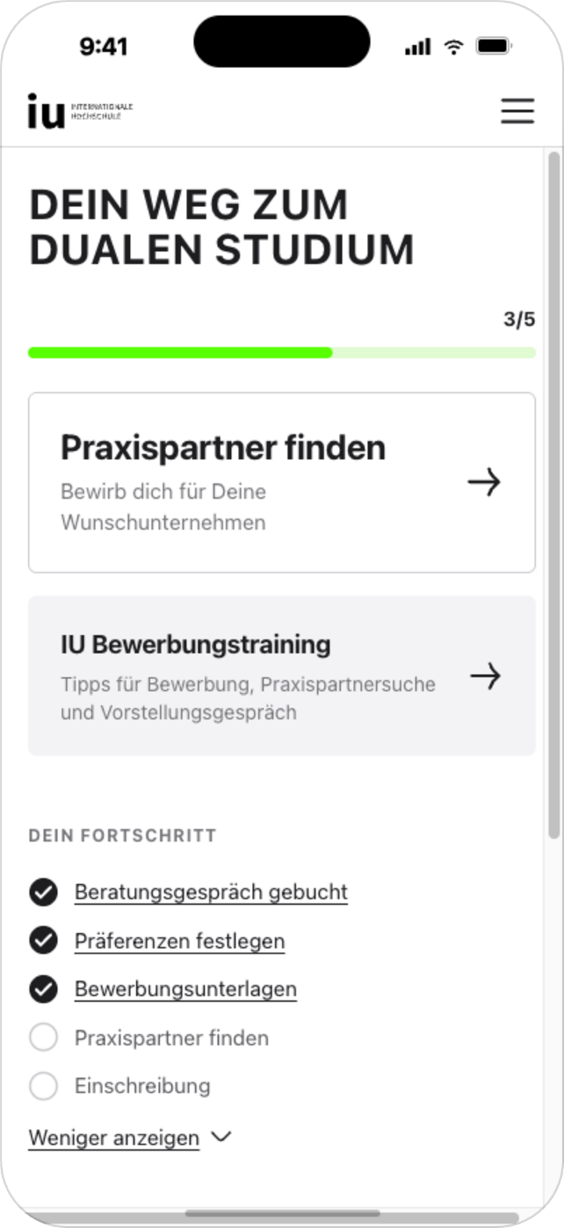
MAIN SCREEN
After the onboarding improvements, we redesigned the portal main screen to give applicants a clearer overview of their journey.
The previous experience required users to navigate between several disconnected steps. The new main screen focuses on the next required action, shows progress and keeps completed and upcoming steps visible without overwhelming the user.
The goal was to turn the main screen into a central orientation point: a place where applicants could quickly understand where they are in the process, what has already been completed and which action matters most right now.
Design decisions:
• one primary next action
• visible progress indicator
• completed and upcoming steps shown in context
• reduced navigation effort
• mobile-first structure
• clearer hierarchy for required actions
During live validation, the new main screen reached 80.8% CTA engagement, exceeding the initial target of ≥60%.
[06]
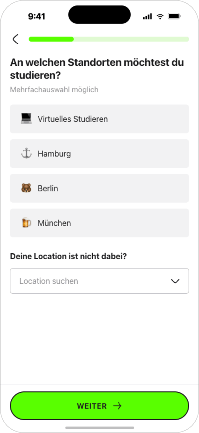
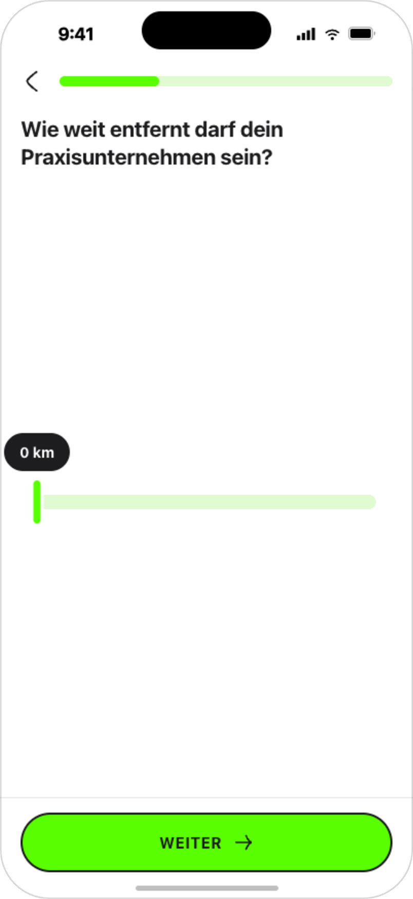
MATCHING CRITERIA FLOW
The next major improvement was a personalized matching criteria flow. The goal was to collect the information needed to recommend suitable practice-placement opportunities without making the process feel heavy or bureaucratic.
Applicants needed to define their preferences, while the system needed structured criteria to filter out unsuitable opportunities and support more relevant matching. For the MVP, we focused on the most important criteria for the highest-priority study programs, while keeping the structure flexible for future expansion.
The flow was designed around short, focused steps instead of one long form. This helped reduce cognitive load and made the experience easier to complete on mobile.
Design decisions:
• one question per screen
• simple and direct language
• clear progress indication
• eligibility-based logic
• preference-based personalization
• lightweight motivational elements
• mobile-first interaction patterns
• flexible structure for future criteria and study programs
Results:
• 80% completion rate • 1 min 25 sec average completion time • 5.13 average matches per eligible user
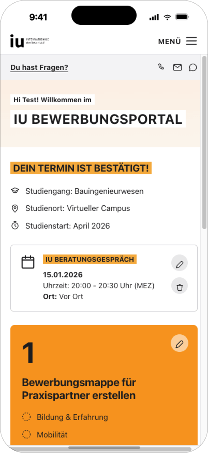
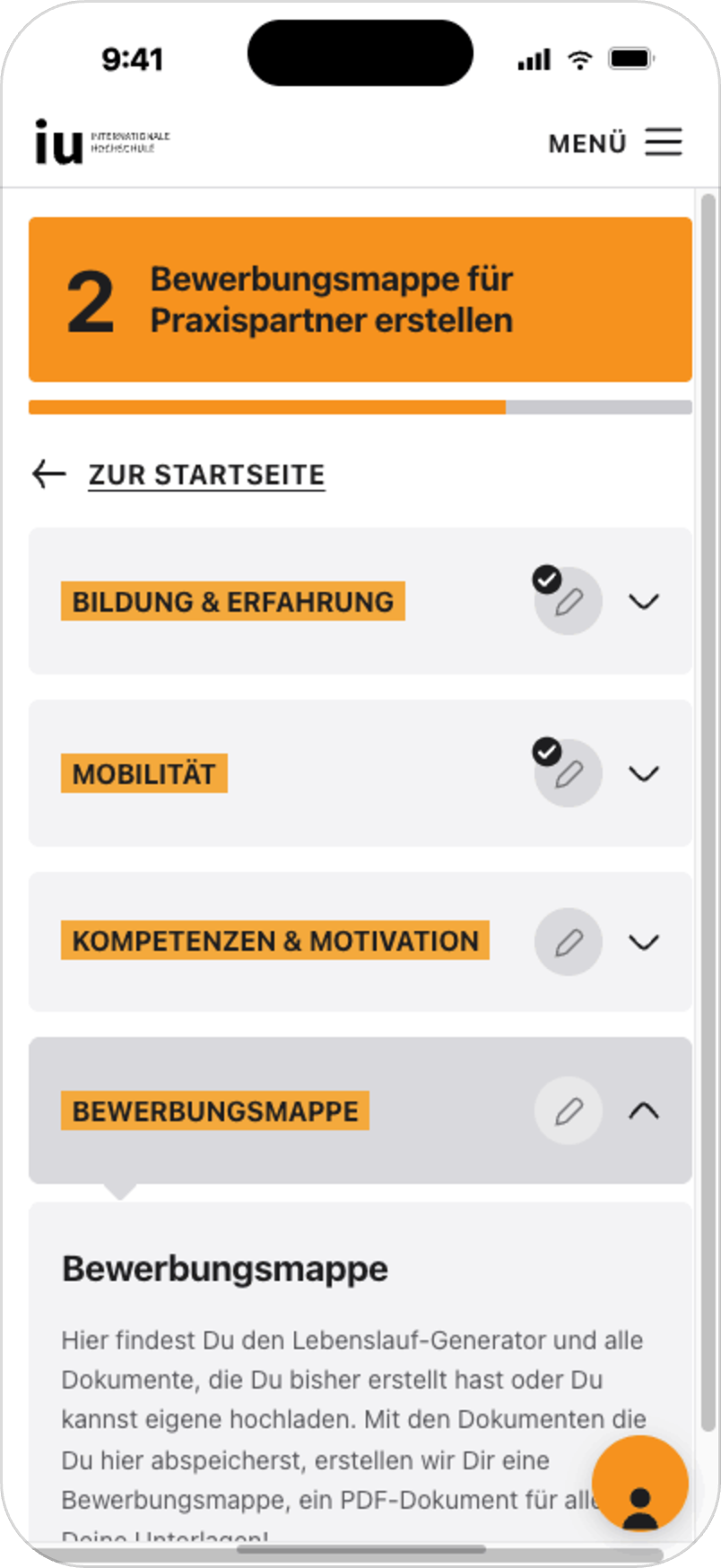
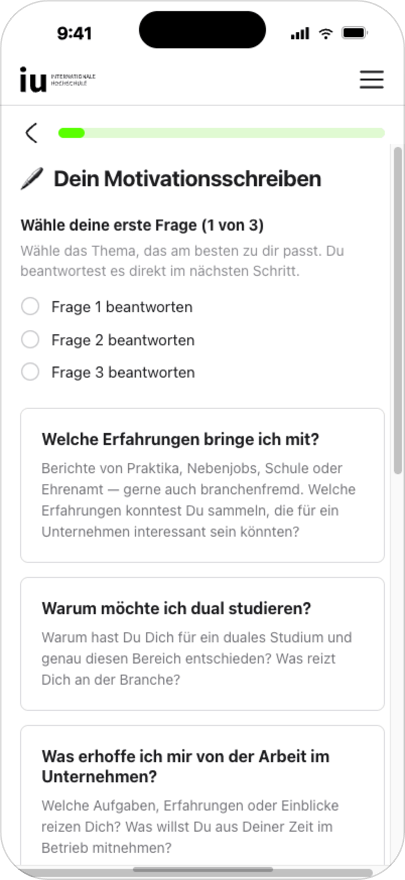
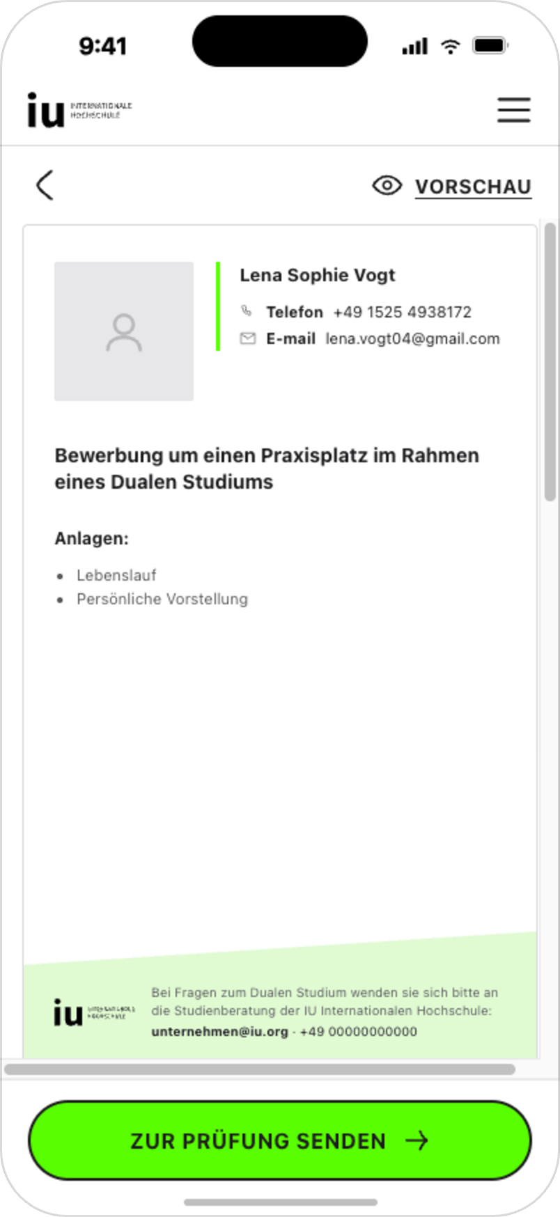
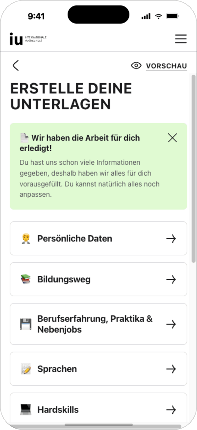
Applicants also needed support preparing application-related documents. The previous process created friction because documents were often prepared manually, errors had to be corrected by advisors and users sometimes relied on external tools.
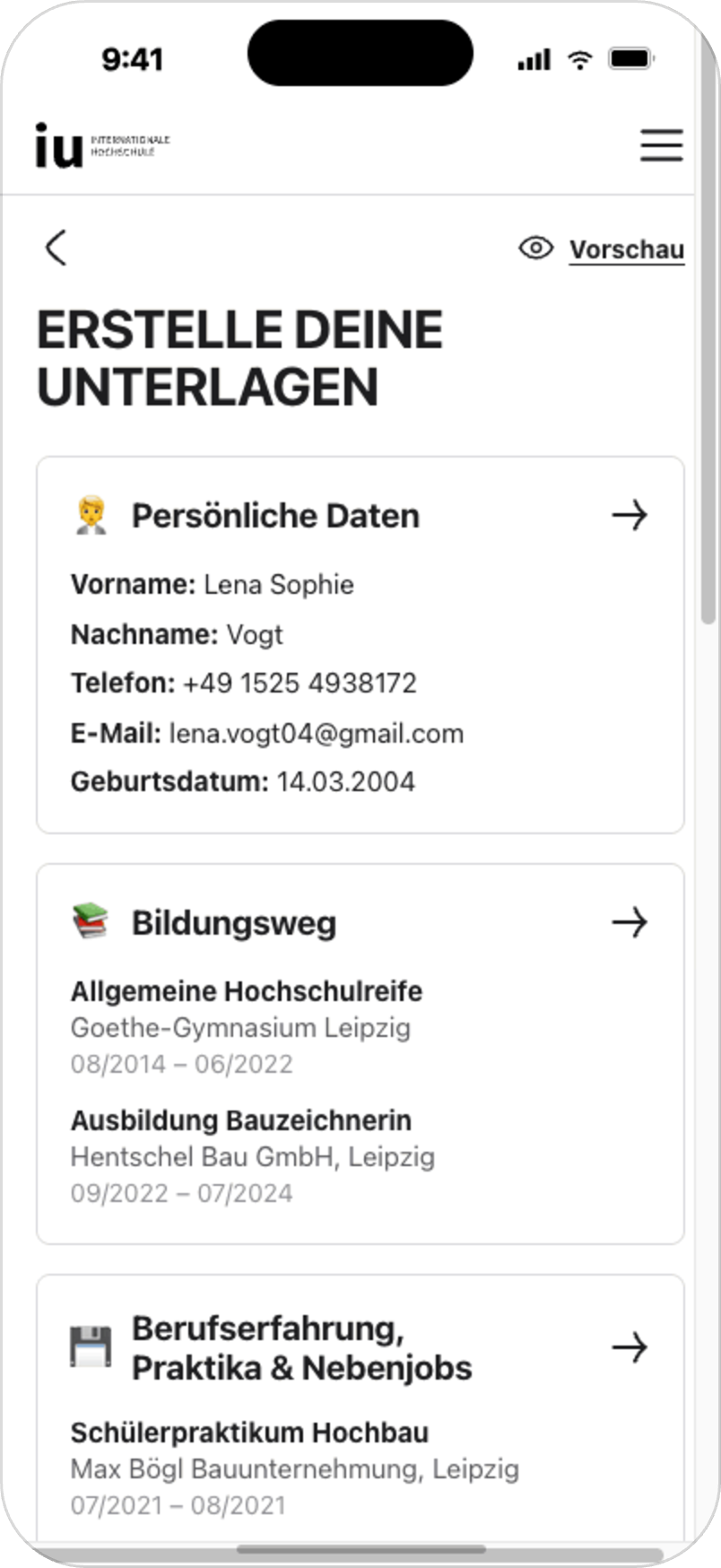
We designed an application document builder inside the portal to guide applicants through the required information step by step. Instead of leaving users to prepare documents on their own, the builder helps them complete the necessary sections, preview their application package and send it to review.
The document builder was designed to address a 46% drop-off in the Examined → Ready to Match funnel stage by helping users prepare the documents required to move forward.
Design decisions:
• step-by-step document creation
• editable sections
• clear guidance for required information
• preview before submission
• send-to-review action inside the portal
• reduced dependency on external tools
• support for advisor review workflows
Early usage signals after release:
• 1/3 of users complete all 11 steps
• more than 50% send their generated application package to review
The next validation step is to measure adoption and impact on the Examined → Ready to Match conversion stage.
APPLICATION DOCUMENT BUILDER
[07]
SYSTEM LAYER AI-ASSISTED PORTAL COMPONENTS
[08]
After restructuring the portal around a clearer main screen and step-based journey, we also needed a stronger component foundation for future flows.
I am currently supporting the development of a portal-specific design system layer based on the existing website design system. The work focuses on reusable components, simplified spacing and grid rules, mobile-first layouts and recurring patterns for cards, progress indicators, form sections, step states and CTA areas.
Using the front-end repository together with Claude Code / Claude Design, I explore how these components can also support AI-assisted prototyping.
The goal is to help the team move from abstract product discussions to concrete prototypes faster. By making shared portal components available for AI-assisted exploration, product managers, developers and stakeholders can contribute ideas more easily, while I remain responsible for evaluating UX quality, system consistency, feasibility and product fit.

[09]
MEASUREMENT & AI-SUPPORTED ANALYTICS
To evaluate the redesigned flows after launch, I created AI-supported Amplitude dashboards using Claude Code.
The dashboards help track funnel performance, completion rates, drop-offs, success criteria and optimization opportunities across the applicant portal journey. This made it easier to connect design decisions with measurable product outcomes and support ongoing optimization.
The measurement setup focused on understanding where applicants progress, where they drop off and which flows need further iteration.
The team also introduced A/B testing capability through a Feature Flags SDK, creating a stronger foundation for future data-driven optimization.
Tracked areas included:
onboarding completion and resolution rates
main screen CTA engagement
matching criteria completion
matching flow completion time
average matches per eligible user
document builder adoption
document builder step completion
send-to-review actions
funnel progression from Examined → Ready to Match
[10]
IMPACT & VALIDATION SIGNALS
[01] +12.1% appointment booking increase through redesigned applicant onboarding
[02] 76.6% / 75.8% completion/resolution rates for German and international onboarding paths
[03] 80% completion rate for the matching criteria flow
[04] 1 min 25 sec average completion time for the matching flow
[05] 5.13 average matches per eligible user
[06] 80.8% CTA engagement on the new main screen during live validation, exceeding the ≥60% target
[07] 1/3 + >50% early document builder usage: 1/3 of users complete all 11 steps and more than 50% send their application package to review
Together, these signals showed that clearer guidance, focused next actions and more structured flows helped applicants move through complex application steps with less friction.
[11]
LEARNINGS
[01] Complex journeys need clear orientation: in a multi-step portal experience, users need to understand where they are, what they have completed and what they should do next.
[02] One primary action reduces cognitive load: focusing each step around one clear action made the experience easier to follow, especially on mobile.
[03] Personalization should start early: qualification logic and matching criteria helped make the journey more relevant and reduced unnecessary friction.
[04] Measurement is part of the design process: Amplitude dashboards and defined success criteria made it easier to evaluate whether the redesigned flows improved the product journey after launch.
[05] Systems thinking supports scalability: portal-specific components, clearer spacing rules and reusable patterns help make future flows more consistent, scalable and easier to discuss across the team.
[06] AI-supported workflows can improve product collaboration: shared components and AI-assisted prototyping help the team move from abstract ideas to concrete product discussions faster, while design quality still depends on clear UX judgment, feasibility checks and system consistency.
[07] Collaboration matters: the portal experience depended on product, engineering, sales/advisory and operational workflows. Close collaboration was essential to design solutions that were useful, feasible and measurable